Welcome back, my fine friends, to a new year. New year, new planners. While the Hobonichi Techo has got a pretty firm lock on my heart, I do recognize that it’s not going to be perfect for everyone, so when the good people of Exaclair reached out to me many moons ago to see if I would be interested in taking the Quo Vadis Plan & Note for a spin, I was all for it. This is a planner coming from a good paper family (Quo Vadis, Clairefontaine, Rhodia are all of the same family), and I loved the Quo Vadis Miniweek back in my pre-Hobonichi days.

– All of my friends have decided that the texture of the cover resembles the peel of a banana. I am now questioning the sanity of all of my friends.
This is the Desk size Plan & Note in Violet. The cover is a rubberized soft-touch cover, somewhat but not quite like the Rhodia Webnotebook in texture, of a mostly firm, semi-flexible cardboard stock. The binding is designed to lay flat, and can be bent back on itself for added firmness and convenience when writing on the go.

On the go. The phrase sounded normal popping out of my head, and now looking at it on the screen is beginning to break down into inexplicable nonsense. How does one get on the go? Is the go going, or is it gone?
A matching purple elastic band holds the notebook closed. Size-wise, I was worried at the “desk” designation – I pictured some vast and endless windswept plain of fountain pen friendly paper, bound by the gods upon some ancient varnished desk. But who would need an elastic to hold that sort of notebook closed? Who would ever be able to carry such a thing anywhere to need to keep it closed? My fears were allayed by the actual facts of reality — the “Desk” plan and note, at 6″ x 8.5″, is an easily portable and slim planner, large enough to be useful while retaining the convenience of a semi-compact size. For at least three months I’ve been carrying this planner around (packed always next to my guilt at not having reviewed it yet), rarely taking care to protect it in any meaningful way. It’s important to see how such things hold up to the rigors and abuse of ordinary life.
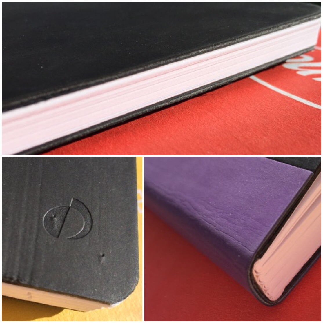
The tell-tale puncture marks indicative of a feline presence
Looking close, you can find signs of wear, but the planner is still looking sharp. If you take even the slightest amount of care (i.e. not throwing it unprotected into a giant lunch bag full of knives, misshapen objects, and miniaturized kitchen implements) I’d wager you’ll still have a sharp looking planner by the time 2018 rolls around.

Unnecessarily dappled shading brought to you by my backyard trees
On to the features. In the front, a standard Personal Notes page, a 2017 reference calendar; in the back, an inexplicable nine pages devoted to contacts. In spite of all the signs, it IS 2017. Who is using this many, or any, planner pages to keep an analog record of contacts in a book only designed to be carried around for the course of one year? If you really keep an analog record of contacts, I hope you have a nice, separate book dedicated to such records, one that is not bound to any particular year. If a contacts section absolutely must be present, give it one, two pages at most. The rest of that space should go to notes, which this notebook currently only has two pages (a front and back) dedicated to. A Plan & Note planner should push the envelope a little more in the note department. Perhaps have the back free notes section include more than one type of layout to better facilitate brainstorming. Instead of all lined pages, you could have two dot grid, two grid, two blank, two lined, etc. This giant contacts section feels like a missed opportunity.

The entire time I’ve been trying to edit this picture on my phone in bed, the cat has been trying to stand on my face, my hands, or both
Back to the front of the notebook, to the first intriguing feature–the Anno-Planner. It’s a two-page spread encompassing all of 2017 that gives each day a little usable line. The second page header bills this as “The Organization of your year at a single glance.” It makes me think of the Bullet Journal Calendex layout. I feel like you’d need to develop your own legend involving some color-coding and symbols to get maximum usability out of this feature, but it holds a lot of promise.

Top: March-April; bottom: January-February.
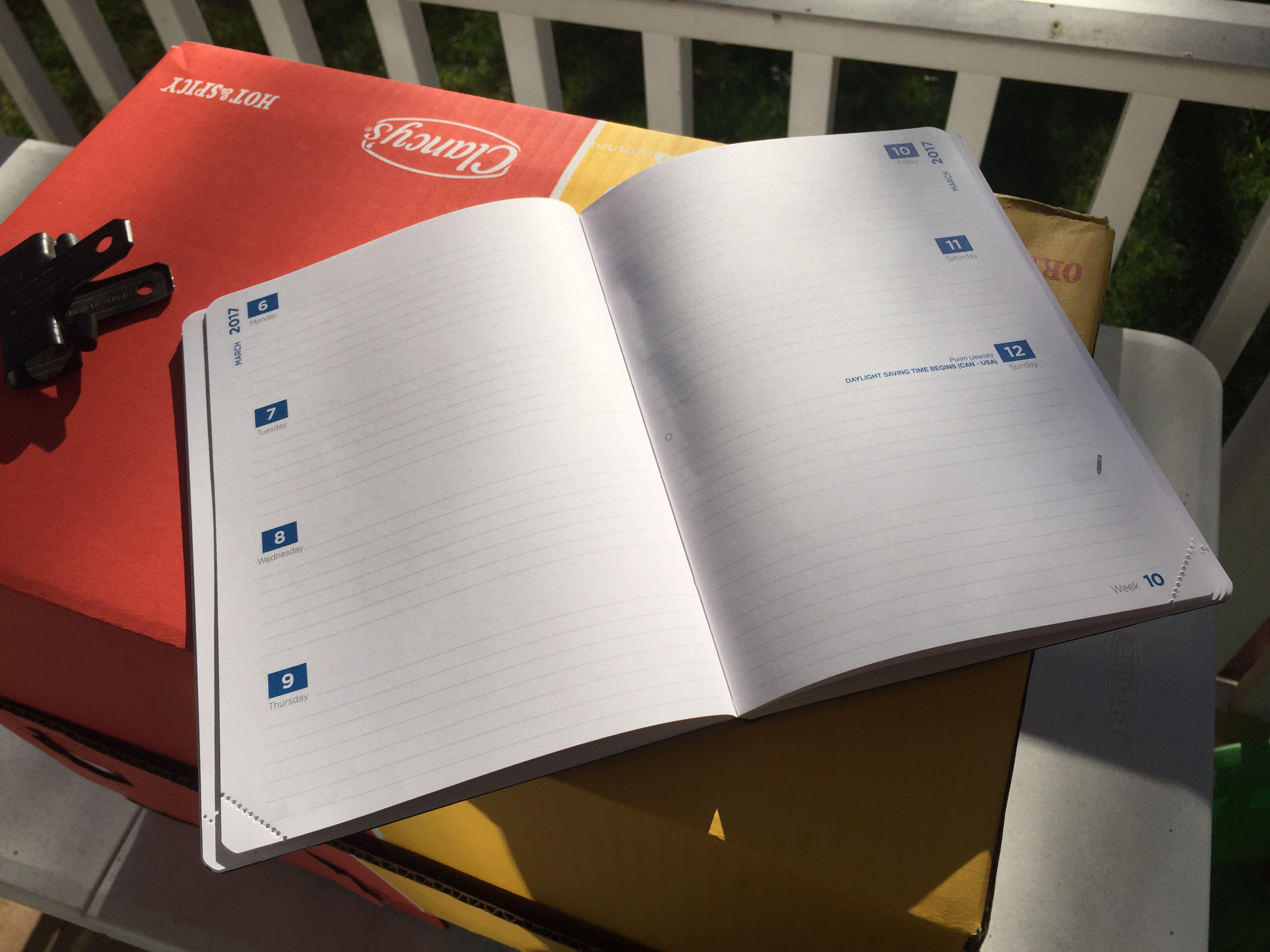
After the Anno-Planner, we have a feature I can’t live without–monthly grid pages. A monthly grid helps me best visualize my life, especially working night shift as I currently do. The layout is oriented sideways to allow for maximum writing space in each square, which feels a little odd but is admittedly useful. My biggest issue with these monthly pages is the repeating of lines at the end/beginning of months. Look at the last week of January and the first week of February up there. It is the same line twice. I find this visually off-putting and potentially confusing. At the very least, don’t print the dates in the same color–where you have overlap, use something like a light grey to print the beginning of February that’s on the January spread, and vise-versa the end of January that’s on the February spread. Or, given that the next line is right there, why print the overlap at all? This issue pops up on every monthly spread; several even end up with two weeks printed twice. It’s wasteful, inefficient, and really throws off my groove. If you’ve got page real estate to spare, leave it blank so it can be used for something like …notes!
I really need more commitment to the Note half of this Plan & Note theme
The rest of the meat of the planner is devoted to the year’s worth of weekly spreads. Each day gets an equal amount of space (which is really nice especially when trying to plan in a business that is open seven days a week), with a section at the end of each week just for notes (notes! finally!!). No complaints here; it’s a solid, standard weekly layout. Each page has a perforated tear-off corner in the bottom, to mark where you are in the notebook and theoretically make it easier to flip to. I prefer ribbon markers for that purpose, but the concept works. I might prefer the perforated corners to be on the top, for even easier flipping. After the weekly spread, there is a monthly grid for January 2018, a 2018 reference calendar, and a 2018 Anno-Planner spread to ease the transition into 2018.

I don’t know if any paper exists that does a decent job with the ink of those little stamps at the bottom. They were forged at the bottom of a volcano out of the decanted acid derived from demon blood. Probably
The pages of the whole planner consist of 90gsm white paper, very fountain pen friendly with no bleedthrough and minimal show-through. The paper shows off shading fairly well (not so much on the sheen factor), with a decent dry-time between around 7 and 11 seconds for fountain pen ink. Most surprisingly, I was able to lay down some watercolors with no bleedthrough and no noticeable buckling of the paper. Although the overall format of this planner doesn’t lend itself to the type of planning/journaling where watercoloring would typically be found, it can be done. Of course, with this brand I expected good paper; thankfully, Quo Vadis delivers.

(Exaclair provided this product at no charge for reviewing purposes–opinions entirely my own)

[…] Many thanks to NoPenIntended for this excellent review of our Plan & Note planner! […]
I have the yellow Hobonichi cover for 2017 also and it is very dirty–and was not in my trunk either just my backpack back and forth to campus. The marks do not wash off with dish soap or other cleansers– I am really not happy about this. I have just purchased an orange Rhodia Goalbook and will start using it in November. This Quo Vadis looks nice too. Enjoyed your review.